WORLD PULSE
Re-imagining a platform for women’s stories
THE OPPORTUNITY
World Pulse is a digital media platform that connects women through stories and skillshare. They wanted to grow their user base by revamping their brand identity and their web app.
My Role: I worked alongside the UX lead to create wireframes and implement a style guide.
Tools Used: Sketch, Photoshop, Pen & Paper
THE PROCESS
Gathering knowledge
The design phase began with regular meetings with the strategy team, reading the client's documented work, studying their existing platform, and looking at how other social media sites were built. One major consideration we had to account for was localization. Even though the site used a Google Translate plugin to make switching languages simple, World Pulse manually translated some pages into French. With this in mind, we considered French translations common enough to create repeatable text elements (buttons, page titles, etc.) and place them whenever possible to reduce friction and optimize for spacing, size, and usability.
We also explored the possibility of creating a "Facebook Lite" -esque version of the web app to help users in areas with slow connections access the site without depleting their data packages.
Defining the scope
After a few internal discussions and client meetings, we decided that the desired product should focus on these three elements:
Enabling signups and donations with clear pathways to action.
Engaging users with opportunities to write, read, comment, follow, and share.
Updating the overall design with re-usable elements and modern practices.
A major challenge was defining the project scope with a tight timeline - the World Pulse team wanted to launch their revamped site in just 3 months. In addition, the platform was already in use, so our solution needed to ensure there were no major disruptions in usability. After speaking with various stakeholders, we created a top-level organization of the redesigned product. We considered this to be our MVP.
Home (landing page) - World Pulse's first impression. Here, it was important to provide clear pathways to key actions (sign-up, login, donate) and demonstrate the legitimacy of the organization.
Sign-up/Login - It was critical to create a seamless signup flow with minimal drop-off to acquire new users
My Pulse - A customizable feed of stories which fosters content discovery.
Profile - A user's identity page that represents their interests, values, and skills.
Resources - A place to discover and create opportunities.
Story and Resource detail - A page with stories and resources can be read.
Changemakers - A World Pulse program which highlights key members and their projects.
Donate - A donation page to support World Pulse's growth.
Acquiring users with a new signup experience
To ensure that World Pulse hit its user growth goals, we introduced a few improvements which would simplify the flow, minimize drop-off, and set users up for success. These improvements included:
Better feedback - A new progress indicator showed users where they were in the sign up process, and how many steps were left to be completed.
Incorporating profile completion into signup - We added opportunities to pre-fill profile information such as a profile photo and topic interests. This helped users get acquainted with the features of the platform and decreased chances that a user would log in to an empty profile and story feed.

Signup interaction flow
Prioritizing people and their stories
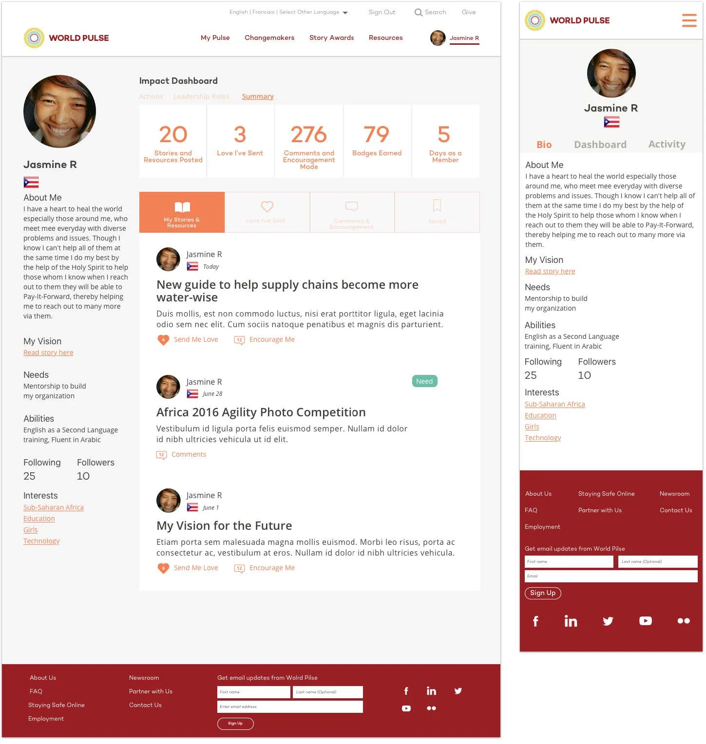
We wanted to place emphasis on the women of World Pulse and their stories through the product. One way we did this was by creating a dynamic profile page. Instead of just being and "About Me" page, the Profile helped user's connect with other parts of the platform by displaying stories they had interacted with (written, liked, commented on). Each user's identity became tied to World Pulse Stories.

Profile page wireframe
Creating an easy-to-learn design system
An important step was to create a cohesive design system that would transcend cultural barriers. Part of this was done by creating and implementing a
consistent style guide. We also created UI elements (story and profile cards) that would be used as the building blocks of the site.

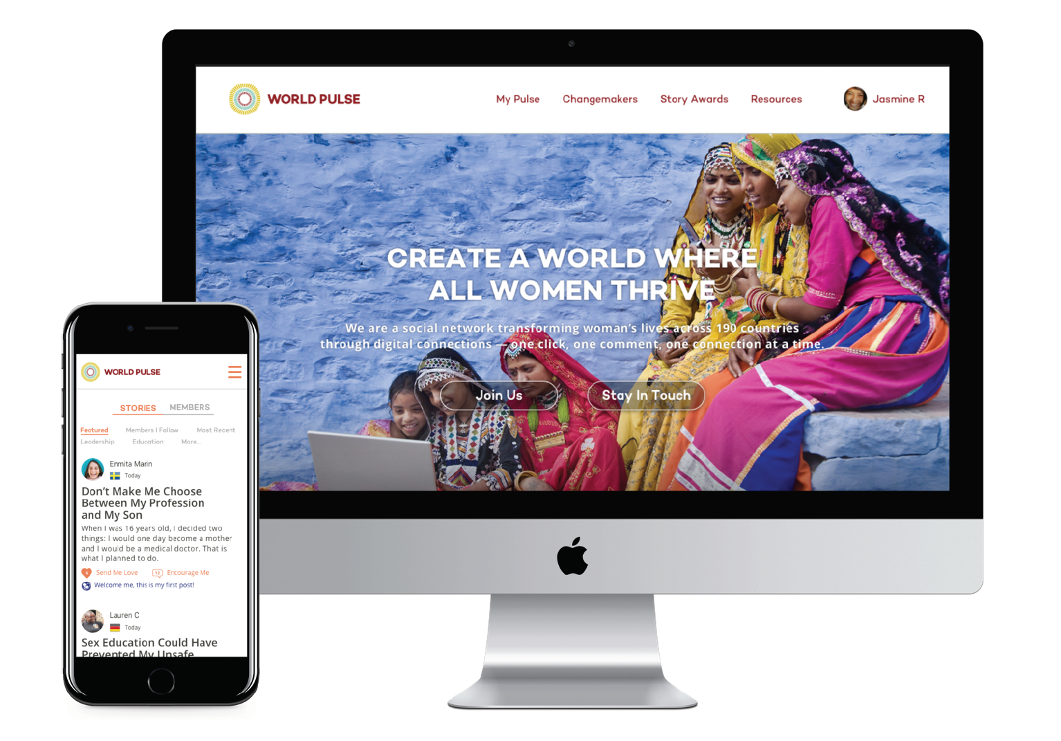
Home page wireframe
THE OUTCOME
A new World Pulse
We created a homepage experience that revealed bits and pieces of the community to visitors. By elevating some of the most compelling content, we hoped it would capture the attention of visitors and convert them into members.

My Pulse: A hub for stories and connections
Once a user was logged in, they had access to customizable feed of stories from the community. We also made it easy for users discover fellow members to connect with.

A more comprehensive World Pulse identity
We made the profile page a destination of interest. A user's profile not only revealed biographical information, but also reveals how this user is interacting with stories and the rest of the community.

IN RETROSPECT
In a short amount of time, our team was able to produce major redesigns to a platform that was serving thousands of women across the globe. I was honored to contribute to a project that impacts women on such a large-scale. Here are some of my key takeaways from this experience:
Qualitative feedback from end-users is helpful for designers looking to build with context. This project's timeline didn't leave much time to gather feedback from end-users, but luckily, design is an iterative process where feedback can be gathered and implemented at almost any stage in the process.
Design systems that re-use simple UI elements not only pleasant to look at, but are powerful because they instinctively inform users about the type of content they are about to consume.
Giving constructive and timely feedback is an art form, as much as the work it takes to put that feedback into action.